Let us
begin with totals. Just tracking the total number of people
in a particular place over time can be revealing. For example, using
federal census records, we can determine how many people resided in
New York City at ten-year intervals between 1790 and 1840. Indeed,
the census takers themselves did the necessary addition, and the government
published the results: in 1790, there were 33,131 residents; in 1800,
there were 60,489; in 1810, there were 96,373; in 1820, there were
123,706; in 1830, there were 197,112; and in 1840, 312, 710. Written
out in a single sentence, these numbers may not mean much. But if
you put them in a table, you should begin to see a pattern.
Table A: The Population of New York City, 1790-1840
|
Year
|
Population
|
|
1790
|
33,131
|
|
1800
|
60,489
|
|
1810
|
96,373
|
|
1820
|
123,704
|
|
1830
|
197,112
|
|
1840
|
312,710
|
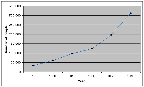
This
graph makes the pattern even clearer:
Graph 1: The Population of New York City, 1790-1840

How can
that be? Graph 1 illustrates the pattern of population growth by decade
in absolute terms. You must still "read" the patterns carefully,
however. It is tempting to conclude from Graph 1 not only that the
population of New York City grew substantially between 1790 and 1840,
but that it grew at a higher rate after 1820 because the line
on the graph rises more steeply after 1820 than before.
Now look at Table B. If you calculate population growth per decade
as a percentage of the city’s population at the start
of the decade, you may be surprised by the results: by this measure,
the decade with the highest rate of growth was 1790-1800.
Table B: The Rate of Population Growth by Decade, New York City,
1790-1840
|
Year |
Population |
Population
growth over decade (absolute difference) |
Rate
of population growth (increase as percentage of population at
decade's start) |
|
1790 |
33,131 |
|
|
|
1800 |
60,489 |
27,358 |
83% |
|
1810 |
96,373 |
35,884 |
59% |
|
1820 |
123,704 |
27,331 |
28% |
|
1830 |
197,112 |
73,408 |
59% |
|
1840 |
312,710 |
115,598 |
59% |
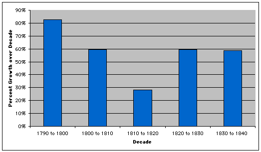
Graph 2: The Rate of Population Growth by Decade, New York City, 1790-1840

Graph 2 visually illustrates the change in the rate of population growth by decade. So what can we learn from Graph 2? By itself, it suggests that New York City’s population increased continuously between 1790 and 1840, but not at a consistent pace. While the population grew at virtually the same rate (59%) in each of three decades (1800 to 1810, 1820 to 1830, and 1830 to 1840), it grew at a noticeably higher rate in the 1790s and a markedly lower rate in 1810s. Why? Neither Graph 2 nor Table B provides an explanation, but were we to carry our study of New York City forward, we would want to investigate what was distinctive about the two "abnormal" decades.