
Following the lead of the new political historians, we will analyze
a real historical data set using correlation. Our case study involves
the presidential election of 1860. As you may recall, there were four
candidates for president in 1860: Abraham Lincoln (Republican), Stephen
Douglas (northern Democrat), John C. Breckinridge (southern Democrat),
and John Bell (Constitutional Union). We are concerned with the pattern
of support for John C. Breckinridge, the most extreme pro-southern candidate,
in the state of Mississippi, one of the first states to secede after
Lincoln was elected. Statewide Breckinridge received 59.0% of the vote,
compared to 4.7% for Douglas, 36.2% for Bell, and 0.0 % for Lincoln.
But Breckinridge’s support was not distributed evenly across all
of Mississippi’s counties. What kinds of counties do you think
most strongly backed Breckinridge? More specifically, do you think there
was a relationship between the density of slaves in a county and its
level of support for Breckinridge? If so, what kind of relationship
do you think there was?
Below you will find a table that lists the 58 counties in Mississippi
for which the following data are available: (1) the percentage of voters
who cast their ballots for Breckinridge in the county, and (2) the percentage
of the county’s total population that was enslaved.
Table C: Percentage of Votes for Breckinridge and Percentage of Population
Enslaved, Mississippi Counties, 1860
|
County
|
% votes for
Breckinridge
|
% slave
|
|
Adams
|
38.3
|
70.9
|
|
Amite
|
52.5
|
64.0
|
|
Attala
|
66.0
|
35.4
|
|
Bolivar
|
43.0
|
86.7
|
|
Calhoun
|
65.9
|
19.2
|
|
Carroll
|
59.8
|
62.7
|
|
Chickasaw
|
65.2
|
55.3
|
|
Choctaw
|
66.3
|
26.7
|
|
Claiborne
|
59.3
|
78.4
|
|
Clarke
|
68.3
|
47.1
|
|
Coahoma
|
38.2
|
77.0
|
|
Copiah
|
65.6
|
51.7
|
|
Covington
|
77.4
|
35.5
|
|
De
Soto
|
37.4
|
59.9
|
|
Franklin
|
67.8
|
57.5
|
|
Greene
|
81.6
|
31.6
|
|
Hancock
|
84.5
|
27.3
|
|
Harrison
|
83.9
|
21.1
|
|
Hinds
|
47.0
|
71.4
|
|
Holmes
|
55.1
|
67.3
|
|
Issaquena
|
42.8
|
92.5
|
|
Itawamba
|
68.1
|
19.9
|
|
Jackson
|
88.3
|
26.4
|
|
Jasper
|
65.3
|
41.3
|
|
Jefferson
|
51.4
|
80.8
|
|
Jones
|
73.3
|
12.2
|
|
Kemper
|
54.8
|
49.1
|
|
Lafayette
|
55.5
|
44.2
|
|
Lauderdale
|
65.8
|
38.2
|
|
Lawrence
|
84.7
|
40.1
|
|
Leake
|
65.1
|
32.8
|
|
Lowndes
|
56.6
|
70.8
|
|
Madison
|
53.5
|
77.5
|
|
Marion
|
88.9
|
46.6
|
|
Marshall
|
45.7
|
60.5
|
|
Monroe
|
65.8
|
59.8
|
|
Neshoba
|
81.0
|
26.5
|
|
Newton
|
73.5
|
35.0
|
|
Noxubee
|
58.4
|
75.0
|
|
Oktibbeha
|
72.8
|
58.8
|
|
Panola
|
38.3
|
62.0
|
|
Perry
|
64.3
|
28.3
|
|
Pike
|
79.0
|
44.3
|
|
Pontotoc
|
56.1
|
34.4
|
|
Rankin
|
56.7
|
52.1
|
|
Scott
|
69.3
|
36.4
|
|
Simpson
|
72.7
|
38.2
|
|
Smith
|
68.4
|
28.7
|
|
Sunflower
|
55.6
|
78.0
|
|
Tallahatchie
|
48.6
|
64.1
|
|
Tunica
|
45.0
|
79.8
|
|
Warren
|
39.2
|
66.5
|
|
Washington
|
47.2
|
92.3
|
|
Wayne
|
62.1
|
52.7
|
|
Wilkinson
|
53.0
|
82.4
|
|
Winston
|
72.6
|
43.0
|
|
Yalobusha
|
54.0
|
56.2
|
|
Yazoo
|
48.1
|
74.7
|
Source:
Great American History Machine
Now let us look at these data graphed as a scatterplot.
Graph 9: Relationship Between Percentage of Vote for Breckinridge
and Percentage of Population Enslaved in Mississippi Counties, 1860
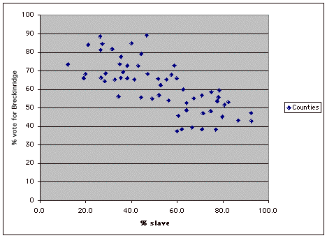
What does the scatterplot suggest about the relationship between support
for Breckinridge and slave density in Mississippi counties in 1860?
ANSWER
With the help of Microsoft Excel, we can further specify the relationship
by calculating the coefficient of correlation. Pearson r is -.73.
What does this number mean? ANSWER
Are you surprised? Many students assume that on the eve of the Civil
War pro-southern extremism was strongest where slavery was most deeply
entrenched. But our analysis of the Mississippi data suggests otherwise.
Support for Breckinridge was greatest where slave density was lowest,
not highest. By itself the existence of this negative correlation does
not explain why Mississippi counties with more slaves were less favorably
inclined toward Breckinridge. Nor does it contradict the fact that Mississippi
as a state voted overwhelmingly for Breckinridge in 1860. Yet if numbers
can speak, this figure cries out for further investigation. As a next
step in the research process, we could turn to election statistics for
other southern states to see if the same pattern holds for them.*
Alternatively we could explore into the Mississippi sources, such as
newspapers or political speeches, further to see what more we can discover
there. Either way, we now know better than to assume that the prevalence
of slavery alone explained the pattern of southern extremism in 1860.
Even if quantitative methods are better at dispelling myths and challenging
simple assumptions than they are at proving arguments about historical
causation, they can serve as critical tools in the hands of all kinds
of historians. As a beginning historian, try to approach numeric data
as you would other types of evidence, with seriousness and skepticism,
and devote enough time and energy to mastering the quantitative skills
you need to accomplish your research goals. Good luck!